The Brooklyn Film Festival, a globally recognized non-profit organization, approached us to develop a fresh visual identity for their event. This comprehensive rebranding project encompassed redesigning the logo, refreshing the colour palette, and conceptualizing the overall look and feel for various printed materials such as festival programs, passes, and more.
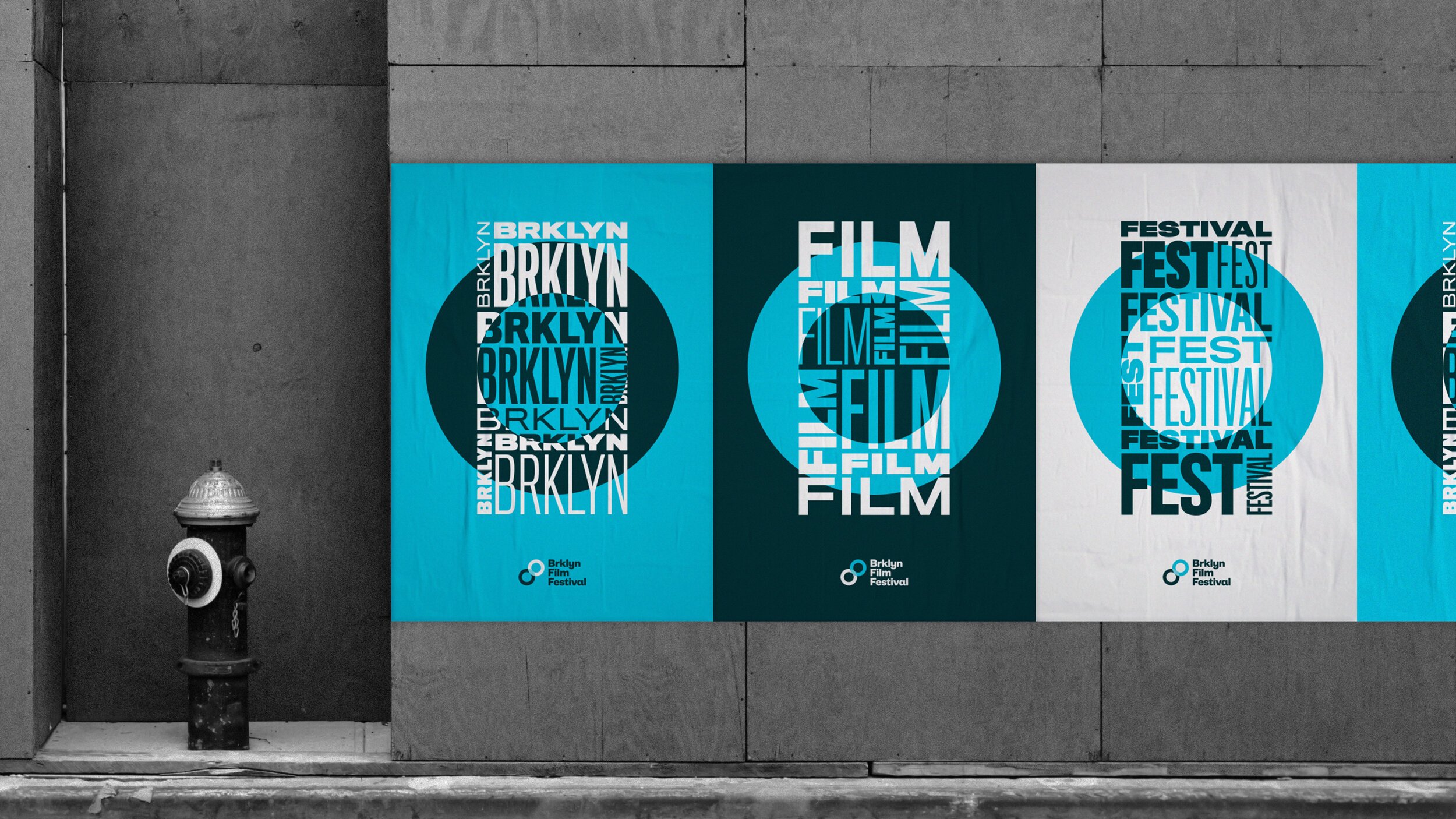
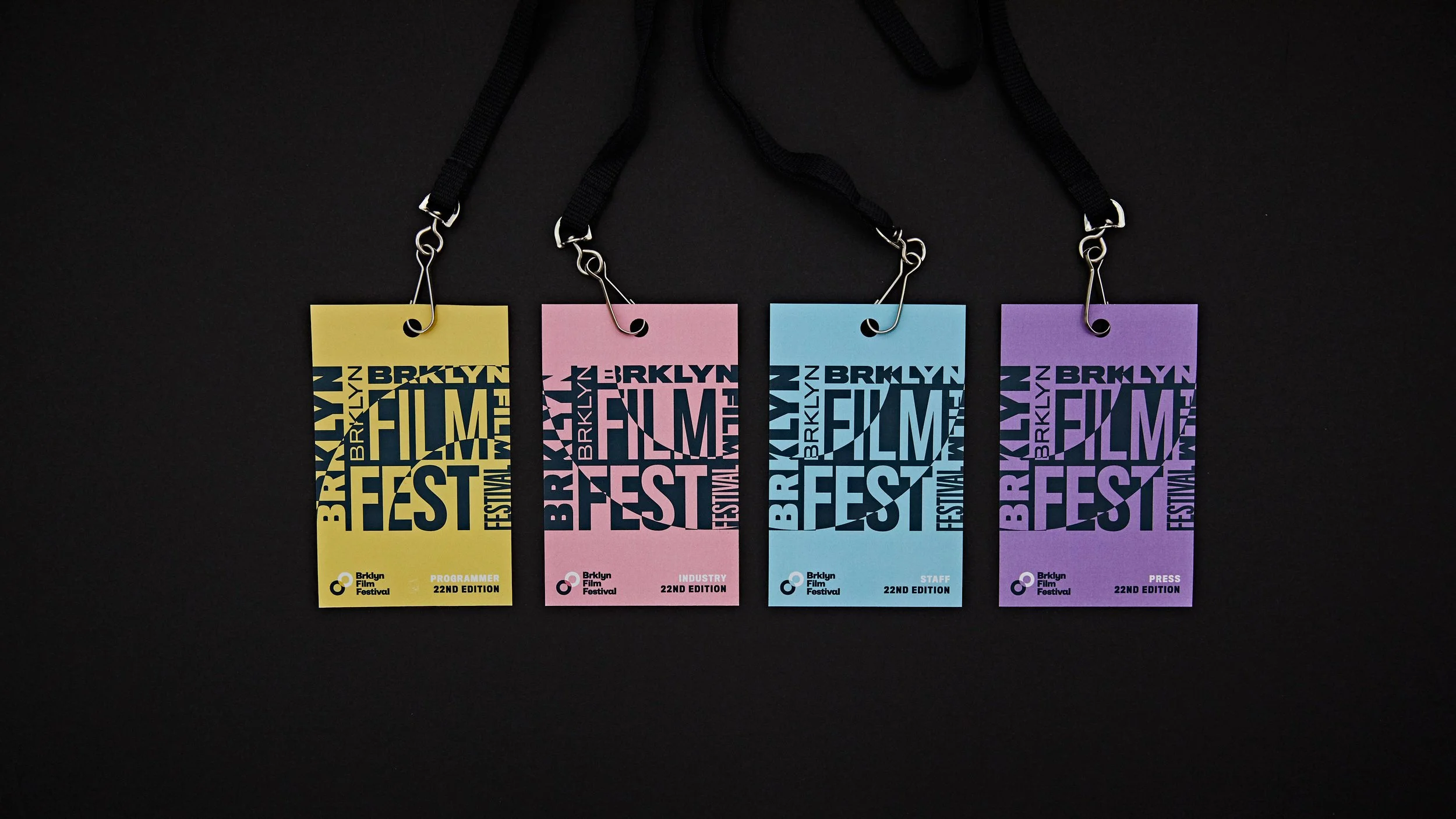
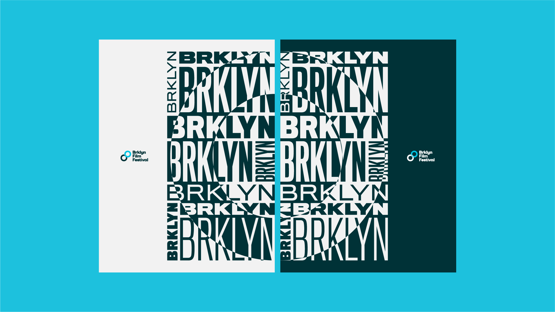
Inspired by the overlapping circles in the logo—symbolizing both a camera lens and the double 'O' in Brooklyn—we crafted a bold, typographic aesthetic. The circular shapes were used to create negative space and distinctive cutouts, adding visual intrigue. For the color palette, we drew from the iconic Williamsburg Bridge, blending a soft steel blue with a rich, rusty pink.
Brooklyn Film Festival
✧
Brooklyn Film Festival ✧
Activation, Art Direction, Design, Editorial Design, Experiential, Photography, Typography
Role
Design Direction under Chris Rowson and Robyn Makinson